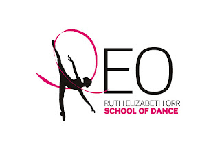
Below are the final collection of logos, many are similar with different silhouettes or writing.
These were printed out and taken into the school for feedback but if you haven't yet seen them please do feel free to leave a comment at the bottom as I value everyone's opinion of the project.
(Please click on the images if you want to see them bigger)
Each logo is shown in black on white and white on black as it will be used in both variations and later with colour too.
After feedback from many teachers and dancers at the school this logo and shone out as being the most popular.
The next step is to experiment with the dancer silhouette. It was pointed out that the dancer does not have a well pointed foot, so I will be fixing this.
I will also looking at more abstract ways of showing the dancer silhouette, through shapes and lines.
Below are some examples of abstract dancer silhouettes
There are also more traditional examples of dancer silhouettes below, I will be looking at and trying out many different styles of dancer, both abstract and traditional to try and find the best fit for the school
After the fine tuning of the logo is complete I will start to look at colours and development the new identity thoughout the school.
Any feedback please comment below!
Rosie


stop
ReplyDelete