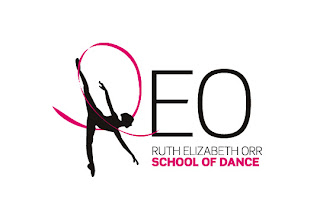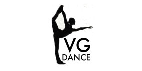
The designs were popular, however after more feedback with the school the decision was made that the block silhouette dancer worked better as part of the logo and as a representation of the school.
I have now fine tuned the logo design that was picked as the most popular, giving her a better head shape and a nicely pointed foot, below is the finished logo design.
Now I am working on colour. Although the logo will post be used in black and white, I think it will be nice to have either a single colour, or small colour palette associated with the school for use of things like newsletters, advertising and the website.
Purple was the suggested colour, so I made a big purple colour palette to try and find the right shade of purple to suit.
I then experimented with using purple in isolated parts of the logo
 And using colour as a background to the logo
As always I would really appreciate any feedback you have to be left as a comment below.
Rosie


